By: Bill Gloede E&P's Editor Explains New Look and Its Nod To History
So what do you think? During the past five months, Adweek Magazines
Editor-in-Chief Sid Holt, E&P Art/Design Director Reiko Matsuo, and I have
been meeting with a design team from the Roger Black studio, talking about
E&P, its history, and that of the newspaper industry. The result is the
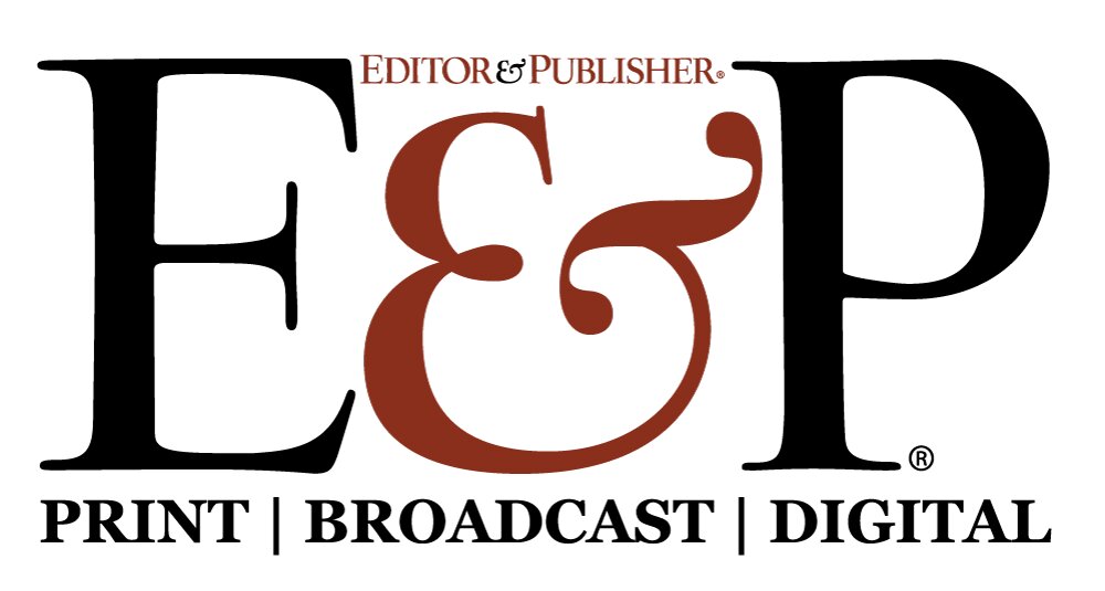
magazine you are now reading. We set out to make E&P look distinctive, from
its cover, which displays a new black logo on a white background, to the
'-30-' page.
The interim redesign we implemented last year when our corporate parent, BPI
Communications, bought the magazine was both attractive and effective.
However, we felt E&P looked too much like other magazines, our own titles
included. Owing to the business it serves, E&P should be different. We believed
the magazine should reflect the art of typography as it was pioneered by the
newspaper industry. White space, open typefaces, and negative leading look fine
in Vogue, but Vogue is not about newspapers.
From our first meeting back in December, the design team, led by Roger Black
Consulting's David Matt, vice president/publication design, and including Art
Director Erin Mayes, Project Manager Jennifer Manzelli, and Designer Jamie Ahn,
there has been a palpable sense of excitement surrounding the redesign of E&P.
We plowed though old issues of the magazine, looking for elements and traditions
we could resurrect and use in the new book. We went through several iterations of
our cover, including an ill-advised attempt to print the E&P logo in a gothic
typeface reminiscent of many newspaper flags. Of that cover, Senior Editor Dave
Astor quipped, 'Looks like the Third Reich meets the Fourth Estate.' We did find
a place for that gothic face. You'll find it on our 'Page One,' the lead news page.
We borrowed liberally from the past, sometimes unintentionally. The design team
settled on a logo based on old-style calligraphy that resembles quite closely the
E&P logo from the early part of this century. At the time, they had not seen
copies of that early E&P.
We dusted off and modernized an E&P icon from the 1930s, 'The Spirit of the Press,'
which you also will find on 'Page One.' Elsewhere, we made extensive use of
headlines, decks, and rules that evoke the newspaper tradition of signaling the
content of stories by the type of head used. And we created a more open,
art-intensive design for our 'NewsPeople' and 'Hot Type' pages and the regular
departments.
In the coming weeks, we will also introduce a new look for E&P Interactive, our
new-media section. In the meantime, we hope you like our new look as much as we do.
Welcome!



Comments
No comments on this item Please log in to comment by clicking here