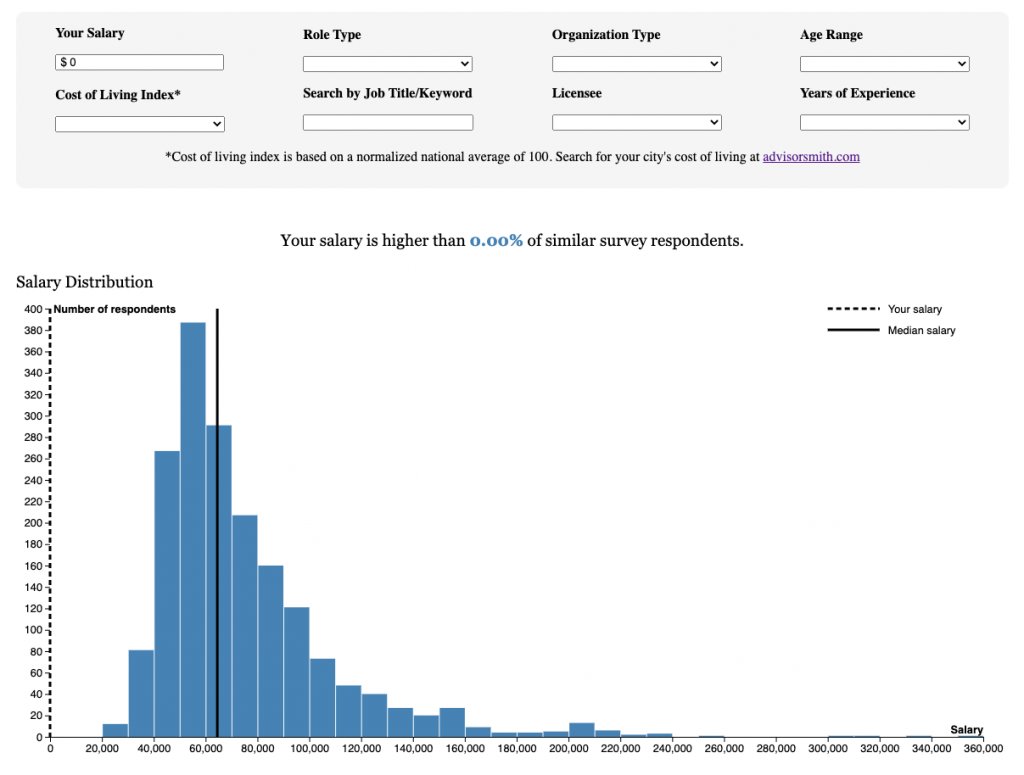
For this project, I helped the Current analyze and visualize data from a survey it conducted of 1,900 public media employees. The survey results included salary data, demographic information and other work-related fields such as years of experience and organization information.
The staff had two goals in mind when we started this project. First, they wanted to run an article that highlighted findings from the dataset that would include various static and interactive charts. However, they also wanted users to be able to explore the dataset to see how their salaries compared to those of other public media journalists with similar work experiences and demographics around the country. To do this, I built this interactive interface using Observable.


Comments
No comments on this item Please log in to comment by clicking here