
If newspaper design had a motto, it might be: “Stick to the format. The design and layout is the brand.”
And that remains true today with iconic titles of newspapers rendered in familiar fonts and layouts that are distinctive in their own right. Think of how familiar and distinctive a title like USA Today is when you flip through the pages. The color, the layout, the way the headlines grab your attention—all part of the brand.
Newspaper publishers, by and large, have always understood this. But the notion that printed newspapers’ design should never deviate from the template is being challenged, and it’s because of digital and mobile publishing and the rising cost to paper. Still, that hasn’t stopped publishers from experimenting with their print product.
When to Redesign
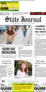 The redesigned State Journal included changing where the mailing label appeared.
“One of the first things we thought about was that our newspaper is delivered by mail, and we wanted to explore whether there was a way to change where our mailing label appears,” said Josh Bergeron, managing editor of the State Journal in Frankfort, Ky. “Originally, the mailing label appeared vertically, right next to our flag, and we wanted to reorient it to be horizontal, so it didn’t intrude down the side of the page.”
Bergeron was instrumental in rolling out the newspaper’s redesign, which was unveiled in May. The new aesthetic for both the print and digital titles is “clean”—an adjective you’ll hear a lot from designers tasked with freshening the look and utility of their newspapers.
Logos, text and photos all got “facelifts,” according to the publisher at the time of the debut. There’s more white space now, though the luxury of white space may be challenged by the rising costs of newsprint and distribution.
As the redesign was announced, Bergeron cited cost concerns as one of the considerations in the redesign.
“Frankfort and Franklin County deserve a newspaper that strives to continuously innovate, and our redesign attempts to maintain its laser focus on local news in a time when newspapers are coping with challenges, such as tariffs on newsprint and increased costs in our business,” Bergeron explained in a statement.
There are fewer pages, and two sections were combined: Opinions and Spectrum (a local lifestyle section).
“Those sections used to be separate, but for the Opinion section, we’d been running a lot of syndicated content, especially when the legislature isn’t in session,” Bergeron said. “Opinion content can run dry then, and because we wanted to run mostly local opinion columns, we felt that we weren’t really hurting anything by getting rid of some of the syndicated content. We still run them, but fewer now since we have fewer pages.”
 Josh Bergeron
The combined section had another impact on the newspaper’s A Section and the content that leads there. When Opinion was its own separate section entity, the publisher didn’t run advertising opposite those columns. The result was that more advertising went into the paper’s first section, and the layout was “tight,” Bergeron said.
Now, with the combined sections and the cost and space savings associated with it, the paper has added additional pages to the first section, allowing for a less cluttered vibe and a greater concentration on local news, which had often been edited to fit the crowded columns. Abbreviated stories would appear in print, while the full versions were displayed online.
Content and audience obviously played a part in the design choices they made to the State Journal. They added a handy calendar of events, a police blotter, and a new way to “jump” to articles.
“Some newspapers have a one-word jump on the jump page, but we decided that what we would do is give readers another entry point to a story. That one word became a short sentence,” Bergeron said. “So let’s say readers open up a page to read the obituaries, and they see a jump to an article, and the jump is a sentence that gives them the context of the article, so they can enter the story that way, even if they’ve missed the first paragraphs on the earlier page.”
Bergeron sees newspaper design as fluid. A decade without some retooling of the design is too long, and there are lessons that can be learned from digital audiences, along with what they expect in terms of white space, fonts and font sizes, and simple navigation from page to page and section to section. He also said it was important to think about what was attractive to readers now and ask the question, “How can we create a more attractive newspaper that resembles more of what people are used to seeing online?”
To date, much of the feedback received from readers has been positive and encouraging, though some have offered constructive criticism about content and design, such as the jump sentences had a larger point size at the behest of readers, and the obituaries have been given a more generous amount of space even with the combined sections.
Rebranding the Brand
In the U.K., The Guardian debuted a new print design in January. It was prompted by the publisher, and according to a press release, the reason was due to a move from its Berliner newspaper format to a smaller size as part of a major cost-saving drive.
The format change created an opportunity to rethink the graphics and layout of the pages, as well. The familiar bold blue banner behind the paper’s name went away. Before, that name had been rendered in lowercase. Now it reads as The Guardian. While column inches remain a coveted commodity, white space is more abundant even in print.
Back in the U.S., the Chicago Sun-Times didn’t just freshen the look of its newspaper and website, it took the opportunity to reintroduce its mission, too. Since April, the print and digital titles have carried a new title graphic and motto: “The Hardest-Working Paper in America.”
Though the editorial mission largely remains the same, the publisher’s mandate to leverage “emerging technologies” in order to better serve readers and reach new ones likely prompted the redesign and re-launch. There were also questions about how best to communicate information for readers who are accustomed to multi-platform reading experiences today, and how to still maintain the newspaper’s self-proclaimed “fiercely urban character.” The publisher opted for “cleaner” pages—both in print and online—with more white space and a decluttered layout.
In Medellin, Colombia, it took several years to completely reimagine El Colombiano, a newspaper with a 100-year history.
According to an article on the Knight Center for Journalism in the Americas website, an ECOLab was created by publishing consultant Martha Ortiz, and it consisted of nine newspaper team members, representing all the major disciplines within the organization, including the newsroom, photography, design and advertising. The ECOLab spent six months redesigning El Colombiano’s print title and almost three years reinventing its mobile apps, website and companion magazines.
Given autonomy and the greenlight by the media group’s leadership, the team endeavored to get a grasp on what the newspaper’s strengths and weaknesses were; what other newspapers around the globe were doing with their design and content; and conducted surveys with locals.
As a result, the newspaper’s format was changed—from broadsheet to a saddle-stitched tabloid; sections got new names; and navigational directives were revamped to be more effective.
For example, the Opinion section (one of the more popular sections with readers) was expanded in order to include more and differing perspectives. Photography was given greater emphasis in the layout, and global news was messaged in the way that it offered local context to readers.
Page Designers Have Also Had to Adapt
The design of newspapers across the country—and how they may be changing—may also be a reflection of the evolving roles of newspaper designers.
Kenn Rodriguez is a designer with the Albuquerque Journal in New Mexico. He began his career in graphics when he was still a fledgling newspaper guy finishing up his college studies. He spent some time working in graphics before transitioning to more traditional reporting roles. When he came to work at the News-Bulletin (a publication owned by a subsidiary of the parent company that also owns the Albuquerque Journal) back in the mid-2000s, his title became “lead sports designer,” though it wasn’t a reflection of the work expected of him.
 Kenn Rodriguez
Unlike the rigid format of the newspaper’s news section—and plenty of support personnel, designers and photographers—the sports section had a more fluid design style and an expectation that the section’s lead reporter and editor would manage its layout.
“For example, when I’d cover a football game, I was expected to be on the sidelines, where I’d take notes, take photos, post in real time to Facebook and (Twitter), all while keeping track of the game stats, which I’d have to publish later as part of the coverage in the newspaper,” Rodriguez said.
That may be a familiar scenario to journalists who are increasingly tasked with “doing more with less,” thanks to fewer bodies in the newsroom.
In Rodriguez’s more recent role as a designer for the Albuquerque Journal, his focus is narrower now, where he is able to concentrate on laying out the newspaper pages for the statewide and regional editions.
Though he misses the challenges of reporting, Rodriguez appreciates that focus and credits the graphic design he amassed at the beginning of his career with landing him the job as a designer today. He’s also grateful for the leaps and bounds made in design and workflow software. He recalls all too well the fledgling days of pagination software—from Quark and then now with Adobe InDesign—when software “glitches” sometimes overcomplicated or stalled the workflow. Gone are the days when designers were asked to be programmers to fill in software potholes. Designers don’t need to know how to write code like they did back then. At the Albuquerque Journal, Adobe’s Creative Suite works seamlessly and makes the designer’s job easier than when they spent an exorbitant amount of time playing “technological whack-a-mole,” said Rodriguez.
Designing Today’s Newspaper
How much has digital design influenced the way the print product looks today?
“Not enough,” said Bill Ostendorf, president and founder of Creative Circle Media Solutions, a consulting, training, design and software firm with a 30-year history of working with newspapers.
“News consumption is changing dramatically with the spread of digital options,” he continued. “Too many newspapers only publish online after their print editions go to bed. That’s nuts. And print is far too backward looking. It is literally yesterday’s news. Content has to be rethought more than design. Print should be forward looking. And rather than being the ‘paper of record,’ we should think of print as our premium product with the best presentation.”
Part of finding the right formula for “the best presentation” is in taking a hard look at reader behaviors and content effectiveness.
 Bill Ostendorf
“Fewer than 25 percent of readers read any of the body type on stories they look at, but photos can be read at a rate of 92 percent more, which means captions can get 40- to 60-percent readership,” Ostendorf said. “Ditto for pull quotes and breakout boxes. And headlines get 60- to 80-percent readership. And all of these things are read before the reader sees any copy, so we teach our clients how to focus more of their limited resources in these items.”
In general, today’s printed newspapers are not as easy to read as they could be.
“Columns of text are so narrow now, they are deadly to readership and reading speed,” Ostendorf said. “Type is badly set, too, which makes the problem worse. All newspapers are far from the optimum column with 15 to 18 picas. Broadsheet newspapers should all be going to a five-column format. Wider columns increase reading speed dramatically. And you can’t say anything in a one-column ad or headline anymore.”
While graphics and layout may come to mind when you hear the term “redesign,” it’s too narrow a definition.
Ostendorf explained, “Our redesigns today are not about fonts and branding and packaging—although we can often dramatically improve all of those things—they are about giving the newsroom a new and more reader-oriented focus. We overhaul the news planning and editing process, change the kind of content newsrooms cover, and upgrade the presentation of that content. That can move the needle. By giving the newsroom a new focus, it can also improve morale and give news staffs the feeling things can get better.”
Ostendorf also suggested that being “pro-print” doesn’t mean a publisher is “anti-digital.”
“I spent most of my career in print, and I still see a lot of potential in print. It’s possible to understand, love and promote both mediums,” he said. “In fact, one of the mistakes the industry made was keeping a lot of print people who had no passion for digital and hiring a lot of digital people who misunderstood or had outright disdain for print. The arrogance on both sides did a lot of damage at many companies. You shouldn’t be running a newspaper company if you don’t have a passion for both mediums.”
The Precarious Power of Paper
The saying is, “Imitation is the most sincere form of flattery,” and that’s the case for the printed newspaper. In its form, a printed paper carries with it a sense of purpose, tactile proof of the labors of journalists and editors, graphics and production professionals. By its nature, it offers assurances that the content on its pages has been carefully curated.
Politicians and political influencers know this, of course, so it should surprise no one that these types of publishers and rhetoricians co-opt newspaper design in order to lend credibility to their messages.
Take, for example, the case of The Idahoan, a conservative campaign literature disguised as a newspaper and mailed to Idaho voters across the state. And that isn’t the only one. Publications of this kind are becoming more prevalent as political tools because they mimic the design and style of actual newspapers. The question remains: Are they effective in duping readers into believing that the content in them has endured the same due diligence and editorial challenges that are inherently part of the process of journalism?
Because these propaganda publications aren’t required to disclose their funding, they may not be as vulnerable to the rising costs of newsprint and printing stocks. This, however, is a serious concern for traditional newspapers across the country.
Ostendorf expects the print tariffs currently affecting the industry to have a sweeping impact. “With the tariffs putting more pressure on newspapers, we’re getting more calls about redesigns again that reduce frequency, page size or page count. It’s distressing, because we can only cut the product so much and still have a viable product. There is a floor, and some newspapers are passing below it. To do so risks a collapse of the franchise, which could be catastrophic. Papers now have little margin for error.”
Many publishers are calling on Congress to get involved—and some members are. A recently proposed “Protecting Rational Incentives in Newsprint Trade (PRINT) Act” is garnering support from senators. A public hearing is scheduled for later this month, and a final determination is expected by mid-September.
Until then, you can be assured that more publishers will be taking a hard look at design and format, while making hard decisions about what content is essential to communicate in print, and what will go away or be relegated to digital.
Gretchen A. Peck is an independent journalist who has reported on publishing and printing for more than two decades. She has contributed to Editor & Publisher since 2010 and can be reached at gretchenapeck@gmail.com.


Comments
No comments on this item Please log in to comment by clicking here