You’d have to be a Luddite or a deserted-island inhabitant not to have some experience with Google Maps. On smartphones, it reigns as the app of choice to plan routes and find local destinations. Google reports 154.4 million people use the app every month.
Mike Reilley is a former journalist who teaches visual journalism at the University of Illinois Chicago. He also founded the Journalist’s Toolbox, acquired by the Society of Professional Journalists (SPJ) in 2007. As part of his role he teaches journalists to effectively leverage digital tools, including Google’s My Maps.
This tool allows journalists to create layered maps by importing shapefiles and layering them with data imported from a spreadsheet of fewer than 1,000 rows.
One of the newspapers he introduced to My Maps, the Santa Barbara Independent, built a layered map with local mudslide evacuation zones and the locations of victims in the Montecito mudslide. The newspaper was then able to tell the story of how far-reaching the devastation was and how 17 of the 23 victims — ranging in age from 2 to 89 years old — were in areas not designated as evacuation zones.
Reilley cited Joel Currier and Walker Moskop at the St. Louis Post-Dispatch, who used Google My Maps to pinpoint, track and archive data related to homicides across the city. It’s an interactive map that not only visually pinpoints the location of the crime, but the type of crime — whether it was a shooting, a police-involved shooting, child abuse, vehicular, stabbing, arson, asphyxiation, beatings and even cases deemed a “justified homicide.” Each pinpoint on the map can be expanded, and a link takes readers to a more in-depth story about that particular homicide victim and case. The newspaper produces an annual version of the map.

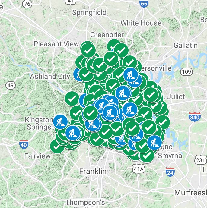
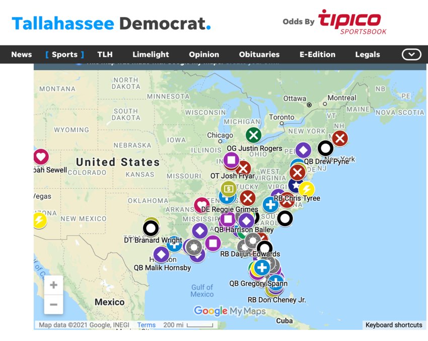
In Nashville at The Tennessean, the newsroom used Google’s My Maps to create a multimedia story about potholes around town and the progress of repairs. The Pensacola News Journal did the same thing, tracking road repairs around Santa Rosa County. In Florida, at the Tallahassee Democrat, reporter Wayne McGahee III produced a map of Florida State’s 2020 football recruitment list, showing from where each of the potential players hailed — state by state and across the country.

Reilley produced a quick how-to video in which he demonstrates how to import shapefiles in .KML and .KMZ formats and then layer spreadsheet data over it. In the video, he quickly maps out potholes across the city of Chicago’s distinctive neighborhoods.
Journalists can also add media complements, such as photos or videos.
Naming your map is essential, Reilley explains in the video, for people will likely find your map in one of two ways — when it’s embedded into your news story or through a Google search. The app has the option of making the map viewable only to people who have the link, or open to public browsing.
Another pro tip: Label each layer.
“There are thousands of stories to be found in datasets on your city, county, state and federal data portals,” Reilley said.
Check out JournalistsToolbox.org for more tips and how-to instruction from Reilley and SPJ.
Gretchen A. Peck is an independent journalist who has reported on publishing and journalism for more than two decades. She began her reporting career covering municipal government at a suburban Philadelphia daily and served as an editor-in-chief/editorial director for a magazine publisher. She has written for Editor & Publisher since 2010 and is a contributing editor. She welcomes feedback and tips at gretchenapeck@gmail.com.
Comments
No comments on this item Please log in to comment by clicking here