It’s a story everyone in the publishing industry has heard before: Adapt to the digital age or be forgotten. The Philadelphia Inquirer received the message loud and clear when they adapted their design and operations strategy last year. Their innovative approach not only ensured their sustained relevance but also effectively preserved their rich historical legacy.
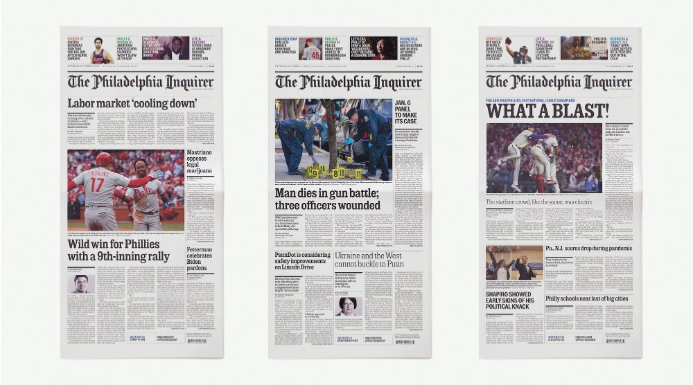
“The Inquirer was first published in 1829 and is one of oldest continually operated newspapers in America, so we wanted our redesign to reflect the special character of Philadelphia — as The Inquirer is inseparable from the city — while feeling appropriately contemporary,” said Lisa Hughes, CEO, The Philadelphia Inquirer. “One way we did that was using a font called Philadelphia Inquirer Clarendon that was used in The Inquirer from 1860 to 1920, but updating it. Pentagram commissioned Henrik Kubel of London’s A2-Type to recut the typeface for us to great effect. In addition, we restored the quirky, distinctively tipped 'd' in 'Philadelphia,' which The Inquirer had used for more than 100 years before a change in 2019,” continued Hughes.
This unique approach fosters readership loyalty by bringing back what is familiar while also modernizing a new take on their history. Hughes explained that, being a multi-platform brand across print, desktop and mobile, they needed to introduce a more unified and contemporary approach to their design and operations strategy. This move not only enhanced the experience for readers but also provided a more dynamic internal process. The Inquirer worked with Luke Hayman and his team at renowned design consultancy Pentagram to give a cohesive update across all platforms.
“It’s important to invest in our product so that our design is modern, consistent and flexible across our multi-platform brand. Overhauling our design process to be more efficient frees up our staff to be more creative and experiment with new forms of storytelling that enhance our journalism, such as our live blogs, which have been hugely popular with readers who want to follow a story in real-time. We want to keep our print readers engaged, many of whom turn to our digital products to get breaking news while attracting a new generation of mobile-first readers,” Hughes said.
This brings into question a critical consideration for modern publications: mobile users. Society has rapidly gravitated towards convenience in the digital age, and nothing is more convenient than the news at your fingertips. Hughes said the new design and operations approach encourages more online interactions.
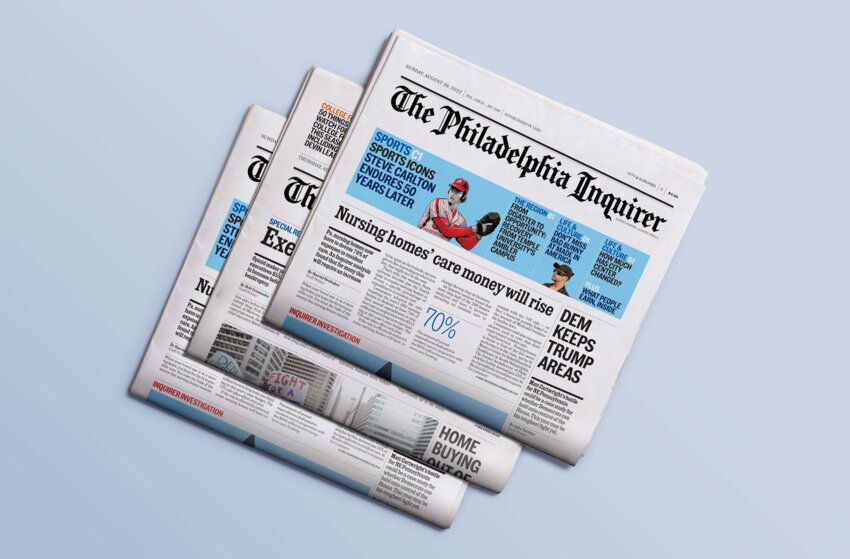
“Many readers also access our products on their phones, laptops and tablets, so there are places throughout the redesigned paper that refer readers to Inquirer.com and our other digital products like newsletters and podcasts. One notable design change was on page A2 of the paper, which now highlights some of the best content on the website, including editors’ picks and a QR code that takes you to inquirer.com,” Hughes explained.
Although digital users are an essential consideration, some readers prefer to read their news the “old-fashioned” way. The implemented design changes to the print version include more prominent and colorful skyboxes on A1 and refreshed section fronts throughout. The page templates are simple to navigate and allow for better graphics and images.
“Besides a coherent multi-platform redesign, we also modernized several in-house processes with tools that streamline workflows and improve collaboration across teams,” said Hughes. “A new layout process allows designers to focus more on images and visual storytelling forms like illustrations, graphics and maps. We put these tools to use with 'A More Perfect Union,' a year-long, multi-platform series that explored the roots of systemic racism in Philadelphia. That project has been recognized in over a dozen national awards, including several for its digital and print design, which Pentagram worked on in collaboration with Inquirer design director Suzette Moyer,” Hughes continued.
Updated and crisp design, alongside meaningful content, is sure to turn some heads in the industry and possibly encourage other publications to follow suit. Coordinating design changes with a more cohesive internal process increases the chances of successful strategy implementation, but that’s not all that went into the design and operations strategy reform. The Inquirer also partnered with Roxen, a small Scandinavian newsroom software company.
In July of 2022, Editor & Publisher quoted chief technology and product officer at The Philadelphia Inquirer, Matt Boggie as saying, “The Roxen Editorial Portal provides a key bridge between our web content management system, in which all our stories originate, and Adobe InDesign. Leveraging Roxen allows our copy editors and print coordinators to focus on the tasks at hand without needing to learn a complex layout system while giving our designers the flexibility they need to create compelling presentations of our most important stories.”
According to Per Östlund, Roxen’s president and CEO, their organization worked closely with The Inquirer and their design partners to identify areas that could be improved. The main focus was implementing their cloud-based print solution that connects to Arc XP. Östlund explained that the purpose of this software is to allow The Inquirer to simplify their workflow and give the editorial team more time to focus on content.
“One of the challenges facing the news media today is to become more efficient — without losing subscribers' interest and trust in the product and loyalty to the brand. Here, Roxen’s over-arching philosophy is to rationalize everything repetitive without compromising the freedom to create the desired reader experience. The time our tools free up for editors in some sections is often re-purposed to give more love to other sections or pages that can make a real difference for the reader and the brand,” explained Östlund.
As with the story of adapting in the digital age, efficiency and cost reduction are challenges that the publishing industry is all too familiar with. It’s a balancing act that requires thoughtful strategizing to avoid sacrificing readership to save money.
“For a long time, the focus in our field was entirely on cost reduction — at any cost — luring some publishers to plunge themselves into a death spiral where the products became increasingly irrelevant, and the brands were diluted. But more recently, there has been a growing understanding that the packaging, in terms of layout, curation, etc., is an integral part of the reader experience. If there is love of the art and craftsmanship of editing involved, it will shine through and affect the relationship between the reader and the product,” explained Östlund.
Östlund explained that the growing fascination with artificial intelligence (AI) will also play a role in the list of growing challenges to the modern newsroom. Östlund predicts that AI will cause a flood in content, making the need for expertly curated designs and packing all the more important.
“I am convinced that print has a lot of mileage left, possibly as a more exclusive product for a discerned group of readers. However, it needs to keep pace with developments and focus on delivering unique content in a form that appeals to the reader. That’s also why working with The Philadelphia Inquirer has been so rewarding since they have made such significant investments to provide their readers with precisely that,” Östlund said.
 Kirsten Staples is a contributing writer for Editor & Publisher. She can be reached at kstaples0329@gmail.com.


1 comment on this item Please log in to comment by clicking here


KurtHildebrand
As an editor of a publication whose flag was created in 1926 to include the Carson Range of the Sierra Nevada, I well know the challenges of preserving a historical brand in the face of pressures to modernize. One of my first acts when I returned to The Record-Courier in 2004 was to borrow the original woodcut from the museum and go to a Virginia City, (Yep, right up the street from Mark Twain's many desks), printer and have it refreshed.
Tuesday, October 24, 2023 Report this